Imagine that you’re going to a gym where groups of people are playing pick-up basketball. There are a bunch of courts, each with its own game going on. How do you decide which one to join? You see a few courts with people going really hard—clearly more intense than you’re ready to take it. You also see a few courts with people who look like true beginners—but you know how to dribble and you’ve got a decent 3. The rest of the courts feature athletes who look like they’re somewhere in the middle. You want to join one of these! But which? It’s a little hard to tell which court features play closest to your skill level.
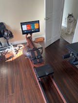
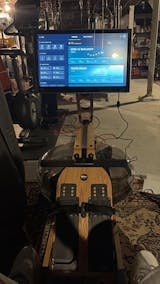
This was a problem we encountered recently. Ergatta offers a workout platform meant to feel more like playing a sport than taking a class. One of our flagship workout experiences is races: think Mario Kart on a rowing machine. You select a race—a segmented workout with any number of working intervals, interspersed by rests. Ergatta matches you to a group of opponents; or, you can select rivals you’ve made on the platform. And then you race! It’s a platform meant to make your competitive spirit drive your workout performance, rather than having an instructor tell you what to do.
Members wanted to get more insight into their competitors. They wanted to race against people at their general skill level—make it challenging, but winnable. They wanted to be able to create rivalries and challenges with people of similar skill levels. This would take our existing concept of automatic matchmaking, and extend it beyond even other workout experiences, to the overall experience on the platform.
So we had to decide how to break our members into groups. How best to do so? We had a few principles we wanted to adhere to:
- Make the classification operate more on your overall capability than on a single simple metric
- Retain the ability to distinguish between sprint capacity and endurance capacity
- Create a distribution that looks—more or less—like a normal distribution
The first principle sounds simple, but is a little more complex in practice. A common standard people pay attention to in rowing is your average split. “Split” is a rowing-specific metric for speed that corresponds to “amount of time it would take you at that speed to row 500m.” In math, it looks like:
$$t_{500m} = \frac{500}{v}$$
Where \(v\) is the velocity in meters/second. But this has a fairly obvious flaw: it is dependent on the kind of workouts you do. For instance, if I typically row races primarily around the 2 km distance, I may row with a split of 2:00/500m. If you typically row races around the 10 km distance, and you also row with a split of 2:00/500m, should we be considered to have equivalent performance capabilities? No! Your ability to hold that speed over a distance five-fold larger indicates that your overall capabilities exceed mine. This falls apart as well for workouts in which you are prescribed not to be going all-out: for instance, interval workouts focused on increasing your aerobic base will have a lower relative intensity, so we can’t just look at your average speed. We need more insight than this.
An insight that drives other areas of the platform is that power output capacity decays logarithmically with the time over which an athlete exerts that power. So we generate a distribution for each athlete on our platform—this generates “intensity zones” that map how hard, in concrete terms, they should be working over set periods of time. This distribution satisfies our second goal: it can distinguish between sprint capacity and endurance capacity. So, in order to make the classification operate on the overall capacity, we needed to take the area under this curve to come up with the “work capacity”. Athletes with marginally different strengths but similar overall skill level should be in the same group. If we take the area under the curve, it should represent the “total” work capacity. Two people with different strengths may have different-looking distributions, but the integral would be the same.
Armed with this metric, we needed to find a way to create a distribution of our member base. We wanted our distribution to look like a normal distribution. That is—in the ideal state, we should have an even number of classes on either side of the mean, and have the number of people in those classes lower as they approach the edges. There are, after all, only going to be a handful of people with exceptional skill and fitness capabilities. Most people are going to be somewhere in the middle.
First, we began by plotting a distribution of our member base of their total work capacity over one hour. Would that work on its own?

Not quite. It looks ok, but would need some work. We decided to use TensorFlow to train a model. Essentially, we could write a transformation function, tell TensorFlow to look for coefficients that minimized loss, and see how that works out. Note that when we talk about minimizing loss, we are referencing loss from our ideal. Our ideal is a normal distribution with a mean and median of 0 and a standard deviation of 1.
We tried a few different functions. Logarithmic and exponential functions ended up not looking quite the way we had hoped. We started to find something interesting when we tried a function that looked like:
$$c + w_1(c_1 + w_2x) ^ a$$
This function offers some ability to skew the distribution and offset it around 0. It does this by using a fractional exponent with weights and bias inside and outside the exponent. The best result we got from here was:

Getting closer. Can we refine this? We noticed that one of the solutions for this function had an exponent close to 0.5, a coefficient w2 close to 1, and an outer coefficient w1 close to 0.5. Reducing this a little bit, we got a function worth trying:
$$c+\frac{\sqrt{c_1+x}}{2}$$
This ended up looking like:

This ended up being a little better—it’s a little less skewed. Another solution from function A:
$$c+\frac{3}{10} \left(\frac{x}{4}-3\right)^{2/3}$$
This one produced better results:

However, in the end we decided that the formula used for this solution was a little too complicated. Yes, precision is important. However, we also believe in keeping things simple and evolving them over time. So we ended up implementing the second function (labeled A-1). Many physical qualities involving power follow power-of-two relationships, so it felt natural. Once we decided upon that, the actual class construction became simple: we simply went out to three standard deviations in either direction, one half at a time, for a total of twelve classes. As such, roughly 68% of our member base falls in the middle four classes, 95% in the middle eight, and so on.
By making classifications, we hope to engender a more competitive spirit. We hope it will allow members of the platform to find competitors in a similar stage of their fitness journey. We hope it will create friendships and rivalries. And we hope that you understand how it works!
Do these seem like interesting problems to solve? Head over to our Careers page and join us!


